Thursday, May 31, 2012

Comic art class cover work

As part of the "Intro to Comic Art" class I'm taking with comicsexperience.com we were asked by our esteemed instructor, Robert Atkins, to pencil three pages of a comic book script.  As someone who has spent quite a bit of time searching in the past, I know how difficult it can be to find scripts online.  So fortunately Robert provided several full scripts - and actually published, major publisher scripts at that - for us to read and chose from.  After some careful deliberation I decided to go with the first three pages of Heroes for Hire (the most recent series) number 5.  I knew that Brad Walker had been the regular penciler on this book but I had no idea that Robert himself had actually penciled this along with issue 4.

We've done some sketches of covers and page thumbnails but, as of this writing, I'm still awaiting feedback for my cover breakdowns and page thumbnails.  The next step would be to complete some page breakdowns and then go on to the finished pencils.

Before I get to showing off any of the page sketches I figure I'll go ahead and post some of the cover stuff I'm working on.  This is all pre-final cover work but I'll post that as soon as I'm finished.


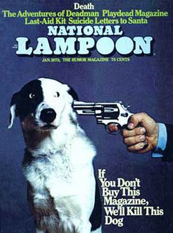
I'm not sure how noticeable it is here but the last image here is an homage of the old National Lampoon magazine cover.  Not something I really considered as an alternative for this assignment but it popped into my head and I couldn't help but use.  Maybe it could be an alternate cover or something like that.

Anyway, Robert liked that there was some variety here but thought that either of the first two images would be a good choice and left it up to me at that point.

The next step was a "breakdown" of the chosen image.  A breakdown is a drawing that while not being as large or detailed as the final pencils allows for more opportunities to work out placement and details of the characters and setting.  After a little bit of consideration I decided to work on the second image (Punisher standing over Misty Knight's seemingly lifeless body).


The lighting on an image like this is very important and working a larger scale gave me more opportunities to define things like light sources than I had with the thumbnail sketch.  I kind of like the ambiguous "doorway" light that's shining here and even think Punisher's shadow turned out fairly well but I found it a challenge to draw a shadow for someone lying on the ground that is consistent with the rest of the scene.  First, off I drew Misty's hair too big so I may not have to worry about so much hair providing a shadow.  But the shadows are very important in a scene like this and I don't want to feel like I'm short changing anything either.


Since I had a hard time choosing between the two I did decide to give this cover a shot as well.  Who knows, perhaps once I was working on a bigger scale and was able to work out some of the details this one would strike me better than the other one.  Couldn't hurt since I would be able to get professional feedback for both of them.

This one has a lot more "story" elements than the other more "noir" cover I did.  I had to do some research on how a puppeteer holds the control (or whatever word they have for it) of a marionette puppet.  I think I'm getting close but I would definitely need to do more research before drawing this an actual cover.  The biggest problem I see, however, is that the size of Puppet Master's hands are too dissimilar.  They should really be about the same distance from the camera and be very close to the same size but it's pretty clear that is right hand is larger than his left.  Not a big deal since I did notice it before the final pencils but it would have been good to catch something like this before I even got going on this "breakdown".

The Punisher figure is really stiff but that's intentional.  He's supposed to be not much more of a puppet or toy in this instance.  But I still wonder if I'm not implying enough of a threat with him so stiff and toy-like.  Misty's suppose to look like she is struggling for control from Puppet Master but I don't believe it is properly conveyed here.  She probably needs some more emotion in her figure and it might be good to make a bit larger as well.  She is pretty much the star after all.

The puppets in the background were a late addition.  It's difficult to tell here but they are suppose to represent the other heroes who had appeared in the series to this point.  From what I can tell this is the end to the first arc of the series so I thought it would be good to get them represented somehow.  Of course the logo is going to really cover them but, oh well.

So there's that.  Once I get the final cover pencils finished I'll post them.  I don't think I'll post any of the page work until the cover stuff is all completely posted but who knows.  Keep your eyes posted!

Tuesday, May 15, 2012

Intro to Comic Art Week 1

About a month ago I went to the C2E2 convention in Chicago.  On the first day of the show I attended a portfolio building panel hosted by Andy Schmidt and Robert Atkins of Comics Experience.  I'm sure I had heard of Comics Experience before but hadn't really given it much thought.  Later on during the weekend I stopped by Robert's table in artist's alley and he was nice enough to spend some time critiquing my portfolio.  We spoke about Comics Experience a bit and Robert mentioned that the upcoming Intro to Comic Art course may be a good fit for me.  I was a bit concerned that an "intro" course wasn't the best course for me to take but I'm glad Robert talked me into it.  Three weeks into the six week class and I can say that it provides great information and course work for people with a wide range of comic art experience.

Anyway, enough of the Comics Experience sales pitch.  I thought I'd post some of the work I created for our first assignment.  The end result of the course will be to have a few pages of sequential art prepared for adding to a portfolio.  However, the first assignment was an exercise in creating sequential pages from a non-comic script.  Robert provided samples from three novels (the Iliad, Fight Club, and 2001) and asked us to create three "breakdown" pages of sequential art based on one of these samples.  I chose the Iliad.  I haven't read any of the selected novels but immediately thought the Iliad might be fun since I knew I was going to have to do some research on ancient Greece.

I really questioned how big I should actually make the final image for the class.  I really thought I may end up using some of my 11 x 17 pre lined comic boards but eventually (thankfully) thought that would be too big for this assignment.  I wound up using the template Robert provided but "blew it up" and fit it on 9 x 12 bristol board.  The actual drawing size is about 6.5 x 9.75.  Still larger than I needed probably but I had a tough time convincing myself to work on anything smaller.

I've "talked" enough.  Here's some art:

Page 1

If anyone is watching Game of Thrones you may notice that the view of the gates of Troy in panel is based on Qarth.  I was watching the show on one of the nights I was putting together references and thought it would be a great stand in for Troy in this instance.

I thought I'd take some time showing some of the sketches that were produced before this page was made and provide some insight into just what the fuck I was thinking!


This is the most complete thumbnail I produced before beginning work on the final page.  As you can see the panel layout was a bit different.  I really wanted to do the three wide panels to begin but I was afraid I couldn't get a good view of Troy in the background of the first panel.  Plus, it was a bit time consuming to draw all those charging soldiers the way it was and I'm kind of glad I didn't wind up drawing even more in these wide panels.

Although the "leaping man" in panel 5 looks pretty similar to the finished product there was some work to be done.  I really wanted something dynamic but felt confined by the number of panels on the page.  Before my final page was started I sketched out some different ideas that I hoped would work.


This shot is actually behind the character (Menelaos) as he's leaping from his chariot.  The left side is the chariot (bottom) and horses (top).


This sketch shows him from the front but I was never really happy with how he would fit in the dimensions I had set for this panel.  I tried some various angles but was never really happy.


Since I was running out of time I started on the page and then went looking for some references on the internet to help me.  The above image is the primary image I used to finally create this image.  (I have no idea who this image is credited to.  But thanks for the inspiration.)

Page 2


There are four "main" characters in this particular section of the story.  Alexandros (Paris), Menelaos, Hektor, and Agamemnon.  These four have to look different than the soldiers and the soldiers on each side have to look different than each other.  The soldiers biggest differences are in the helmets and shields since I figured that would be the most obvious.  The story mentioned something about Hektor having a "shiny helm" so I thought I'd give him one.  Plus it gave me an opportunity to draw a kick ass Greek helmet.


Here are a couple of thumbnails for page 2.  Even though I know this will never be "complete" and lettered I did take into consideration where some of the word balloons would go since this would be a pretty conversation heavy page.  I choose the panel layout of the last thumbnail as my final.  As you can see that presents a problem since the first page is a bit too similar.  Robert pointed this out during the class critique.  I did notice it as well but I was way too far into it to change things.  The biggest problem is that I had chosen my page layouts for all three pages but called an audible before starting the first page.  The panel layouts would have been different enough (I think, at least) if I hadn't changed things up at the last minute.  But once I did I wasn't thinking about what the next page looked like.  I guess a lesson can be learned here; the thumbnail and page planning stage is very, very important.

Page 3

Third page.  Agamemnon is shown for the first time in panel one (Agamemnon wasn't even flagged by blogspot's spell check?  Really!?).  Since he's a king I tried to make him appear to be in some sort of grand chariot thing but I don't think I did a good enough job of establishing him in the background of the previous panels to just throw him on the page here.  He does look important though.  A couple of the more noticeable issues are panels that are too similar to ones on previous panels.  The most egregious being the last panel on this page with last panel on page 2.


This is a fairly faithful representation of the final page.  Things went pretty well from the get go but I did have to work out that first panel a bit:


I was trying to work in the horses for the chariot initially but I thought I was a bit limited by the number of panels on the page.  Seven is quite a bit and I wanted to make Agamemnon as large as I could since this was the first time anyone is seeing him and he is a fairly important character.  The last sketch here actually has him flanked by guards, which would make this chariot-thing really big.  Again, I got rid of them because of panel size issues.

Well, there you go.  Art post no. 1 out of the way.  I'll try to keep this updated as possible during the duration of the course.  I think it would be fun to share some of this as the class progresses.  But of course, is anybody actually listening?


Monday, May 14, 2012

Hey there!

Welcome!  After getting some professional advice regarding the advantages of keeping an art blog I've decided to stake out a little corner of the blog-o-sphere for myself.  I've had a deviantART account for many years and since I was already using it to post my work I never gave having a blog much thought.  But it will be nice to have a place to post more sketches and some the of "nuts and bolts" aspects of the process.  Plus I'll have another avenue in which I can perform some additional shameless self promotion.  Because, as I'm beginning to realize more and more, it is really, really important.

Enjoy!